Google Slides is one of the most advanced presentation programs and is right up there with the likes of Microsoft PowerPoint. Many would even argue that it surpasses every other competitor, including PowerPoint, because of its collaborative tools and inventive features. There can be several different things you can use Google Slides for. One of these is making organizational charts.
These charts are pretty standard in business and office presentations. However, they are not that easy to make with individual graphical elements. That way, you might spend more time than you should on a simple chart that will only be on a single slide. We will show you how to make, edit, and manage organizational charts using Google Slides in the following article. These are not necessarily for presentations and can be exported as images or other formats.
- Recommended: how to make box and whisker plots in Google Sheets
What is Google Slides? How does it work?
Before seeing the actual process of making an organizational chart, let us briefly describe Google Slides. It is a web-based software that can be used for creating presentations, templates, graphics, social posts, banners, posters, cards, and so much more. Google Slides can be thought of as an online counterpart to PowerPoint. What’s great is that you can use web tools for sharing content while still being able to edit every file offline. Since the beginning, Google Slides has been a part of the Google Workspace and has only improved its capabilities over time.
Like all other Google services, all Google Slides enjoy inherent support on Drive and additional cloud storage. You can use this to move around your important presentations and templates within no time. Besides, if you are working on something with a group of colleagues or team members, there is an option to provide real-time access to all individuals simultaneously. We can go on and on about how resourceful Google Slides is. It would be better to go back with our topic and pick up some things about organizational charts.
What are organizational charts?
Organizational charts provide a graphical method of describing an organization’s internal structure. Each person/individual in the company is represented with a rectangular box. These boxes are arranged in hierarchical order and may include position, profile picture, and contact information. All in all, these charts provide a clear and concise intuition of what the structure looks like. It distinguishes between different departments, ranks, seniority levels, and more.
These charts are not new and have been in use for quite a long time now. However, HR departments used to make these by hand or manual programs. You can now generate one without hassle, thanks to Google Slides or any dedicated organizational chart software.
In total, there are three general types of organizational charts. The hierarchical chart is the most common type used for establishing junior / senior associations. On the other hand, a matrix chart depicts the usual workflow for a typical project. The flat chart, also known as the horizontal organizational chart, is mainly used when there is little to no middle management. The subsequent sections detail step-by-step methods for making and formatting these organizational charts in Google Slides.
Making an organizational chart in Google Slides
In Google Slides, there are two basic methods for creating organizational charts. You can manually generate each block or use the pre-formatted diagrams already present in the library. Since the manual approach does not seem to offer any additional benefits, we will only discuss the second method. It would end up saving a lot of time and effort. Besides, if you want formatting options, use the available ones after the diagram gets inserted.
Step 1: Launch your preferred internet browser and go to “Google Slides.” Log in with your account.
Step 2: Click on the “Blank” preview at the top to start a new presentation. That will open an untitled document on your screen.
Step 3: Click on the “New Slide” icon in the top left corner and insert a “Blank” slide.
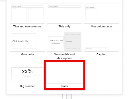
Creating a blank slide
Step 4: Go to the “Insert” tab in the Google Slides taskbar and select “Diagram” from the drop-down menu. A windowpane for different diagrams will slide in from the right side.
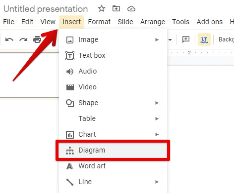
Inserting a diagram
Step 5: Click on the “Hierarchy” tab. Select the number of levels and chart color from the top.
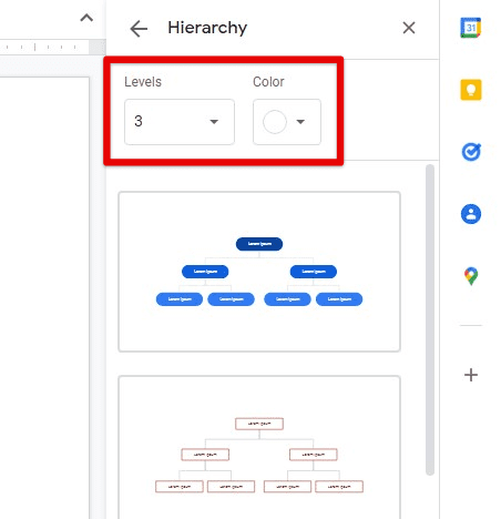
Selecting levels and colors for the chart
Step 6: Scroll down to find the appropriate chart format and click on it. That format will be inserted into your slide at once.
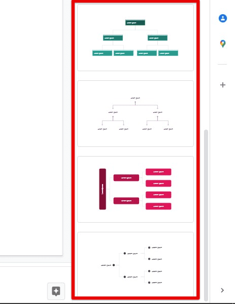
Choosing an appropriate chart format
At the moment, all of those boxes are just going to be filled in with Lorem Ipsum text. The following section contains all steps to set up, format, and structure your chart in great detail.
Formatting organizational charts in Google Slides
After you insert the required organization chart in your slide, the next step is to format it according to your specific requirements. These charts can take up several different shapes and layouts, as we discussed earlier. By moving around individual boxes and editing their contents, you can present them however you want.
Step 1: Go to the slide that contains the chart—double-click on any of the boxes to change their text.

Editing box contents
Step 2: For accessing additional options, right-click on a box. Go to “Format options” from the drop-down menu.
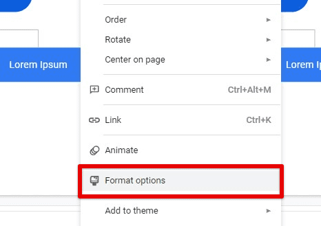
Opening format options
That will open up a new window on the right side of your screen. This pane contains five tabs on formatting elements within your organizational chart.
Step 3: The “Size & Rotation” tab contains options for width, height, width scale, height scale, aspect ratio, and box rotation. You can also flip the items vertically or horizontally.
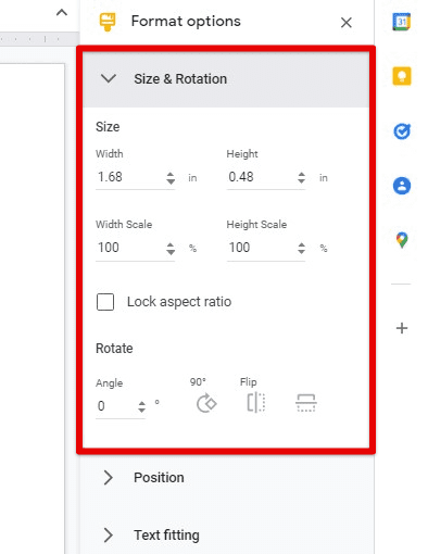
Size & Rotation tab
Step 4: The “Position” tab is used for determining the relative position of a box inside the chart. Select a reference point and then use the X and Y coordinates to pinpoint specific locations.
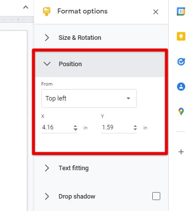
Position tab
Step 5: The “Text fitting” tab deals with the text indentation, autofit controls, and text padding from all four sides.
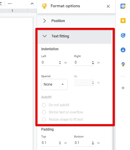
Text fitting tab
Step 6: The “Drop shadow” and “Reflection” tabs deal with the aesthetic aspects of the chart. You can use them to display shadows and reflections with adjustable transparency, color, angle, distance, and size.
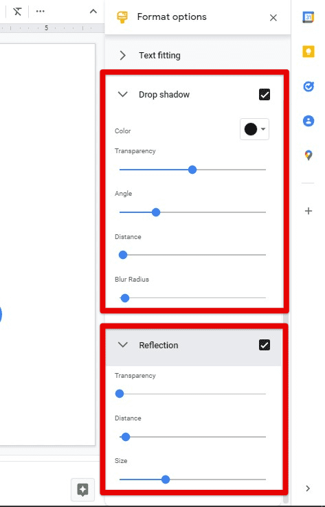
Drop shadow and Reflection tabs
Importing and exporting organizational charts in Google Slides
It is also possible that you already have an organizational chart prepared on one of the other Google platforms. In those cases, Google Slides lets you import a chart directly from these programs. They get inherently supported in Slides and can be formatted just like other drawings.
Moreover, once you have completely set up the chart and edited it accordingly, it can be exported as a JPG, PNG, or SVG file. Such export options enable you to transfer the organizational chart from Google Slides to any other program on your device.
Step 1: Launch your preferred internet browser and go to “Google Slides.” Log in with your account.
Step 2: Click on the “Blank” preview at the top to start a new presentation. That will open an untitled document on your screen.
Step 3: Click on the “New Slide” icon in the top left corner and insert a “Blank” slide.
Step 4: Go to the “Insert” tab in the Google Slides taskbar and select “Chart” from the drop-down menu. A side window will open right next to it. Click on “From Sheets.”
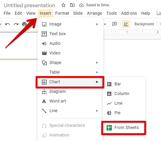
Inserting a chart from Sheets
Step 5: You will now see the “Insert chart” window on your screen. It contains all Google Sheets files on your account. Select the one which includes the organizational chart.
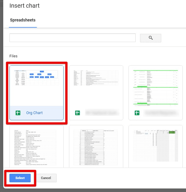
Selecting the Sheet with the organizational chart
Step 6: Google Slides will automatically detect any charts present within the selected spreadsheet. Click on the “Import” button in the bottom right corner to complete the process. Ensure that the “Link to spreadsheet” checkmark is ticked before doing so.

Importing the chart
Note: Once an organizational chart has been imported into Google Slides, you can format it by following the steps described in the previous section.
Step 7: Confirm that you are on the same slide that contains the organizational chart. Go to the “File” tab in the Google Slides taskbar and select “Download” from the drop-down menu.
Step 8: Side window will open right next to it. Click on “JPEG image (.jpg, current slide).” Doing so will export the chart in Google Slides as an image.
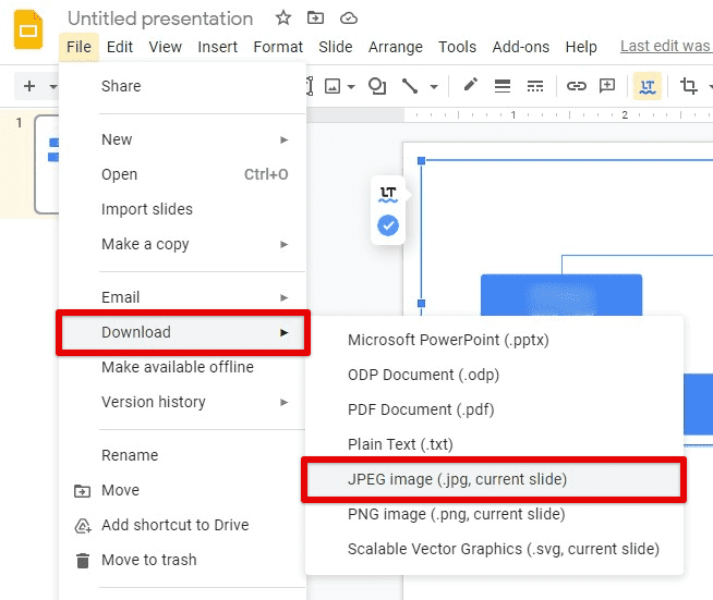
Downloading the chart as an image
Conclusion
Organizational charts are a great way to represent the internal structure of any company, association, business, or organization. They offer a detailed look into any enterprise’s workflow and hierarchical layout. Thanks to the pre-defined diagrams in Google Slides, you can use them to make these charts in minutes. There are tons of format options and other tools for importing or exporting these illustrations in different formats. Creating, editing, and sharing organizational charts has never been easier than having these excellent features at your disposal. Google Meet now lets you join calls from Google Docs, Sheets, and Slides. Go to this link for the detailed guide.
