A Box and Whisker plot helps understand the five-number summary of any data set. This plot does not show individual data points or the spread between those points. On the other hand, this plot visualizes the minimum, lower quartile, median, upper quartile, and maximum points.
We can then draw a Box with whiskers on both ends representing the minimum and maximum values with these five points marked. Usually, this plot is employed to identify the outliers in any particular data set. Moreover, it can also be used to compare two different sets of values and understand the difference between their broad range and spread.
Box and Whisker plot in Google Sheets
Google Sheets is a well-reputed platform for storing data sets and information in numerical form. Plots and graphs are essential to analyze that information and display it in a way that can be readily understood. One of the plots that justifies this very role is the Box and Whisker plot. It is not only widely used in data analytics but is also relatively easy to comprehend. With a Box and Whisker plot, you can identify the overall trends in a data set without going into unnecessary details. This makes this a valuable plot for students, researchers, and data scientists alike.
The problem is that Google Sheets comes with plenty of different plot types incorporated with the platform. To draw those, all you need is to select the data range and then click on the respective plot type. Unfortunately, Box and Whisker plot is not included in those plots. Therefore, users must develop ingenious tricks and methods to draw a Box and Whisker plot in Google Sheets.
In this article, we will go over a Box and Whisker plot, how it is made, and how we can draw it from the data stored in Google Sheets. We need to go around the usual drawing a plot in Google Sheets has rendered this method somewhat challenging.
What is a Box and Whisker plot?
A Box and Whisker plot is mainly used in non-financial industries. It can be thought of as the counterpart of the candlestick chart. The main frame of the plot looks somewhat similar, but the points represented by the box in this plot are not the same. Moreover, the Box and Whisker plot is typically drawn horizontally, whereas the candlesticks are displayed vertically, as you must have seen in trading markets. We have already described there is no support for Box and Whisker plot in Google Sheets. So, we will use the candlestick plots to come up with one.
In a Box and Whisker plot, the box’s boundaries represent the lower and upper quartile marks. The lower quartile is the value at the center of the first quarter. The upper quartile is the value at the center of the last quarter. This means that most of the data points in that set are represented by the box. However, the whiskers on both ends indicate the maximum and minimum values outside these quartiles. Moreover, some outliers in the data set cannot fit in with the overall trends.
With the distribution of any set visualized within seconds, the Box and Whisker plot is regularly used in several different situations. It can also tell you if the points in that data set are spaced evenly or not. A perpendicular line is also included in the box, which cuts it to mark the median value of that set. This value is located at the center of the entire data set. Now that you understand what a Box and Whisker plot is, we will go over the method of making one in Google Sheets.
Making Box and Whisker plot in Google Sheets
Candlestick plots are used to indicate four data points. These include the maximum, minimum, first quartile, and third quartile values. Thus, most of the points displayed by them are the same as those in the Box and Whisker plots. This makes them an excellent choice as an alternative in Google Sheets. However, for the sake of this tutorial, we are going to assume that you have a list of 10 numbers to be represented in a Box and Whisker plot.
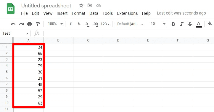
List of 10 numbers
Before you move on to draw the plot itself, the five summary descriptors are to be calculated. We will use their respective formulas to find the accurate set of values for all five descriptors. This will save us a lot of time because we do not have to calculate them manually. Once those values have been computed, we can quickly draw the plot.
1. Finding minimum value
Step 1: Select that particular cell inside the sheet to display the minimum value.
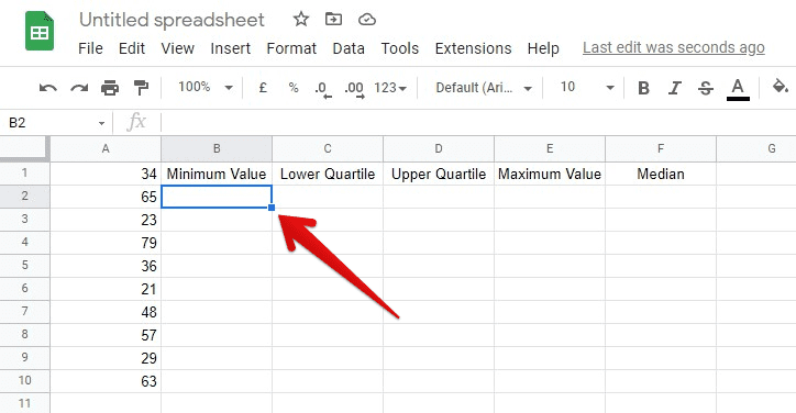
Selecting a cell for minimum value
Step 2: Type “=MIN(A1:A10)” in the “Formula Bar”. Press the Enter key. Make sure to replace A1:A10 with the range of cells you are interested in.
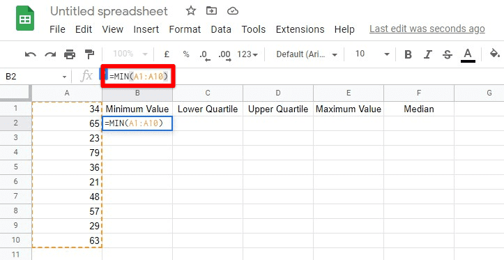
Implementing MIN function
Step 3: After you press the Enter key, the cell you selected will display the minimum number from the entire set.
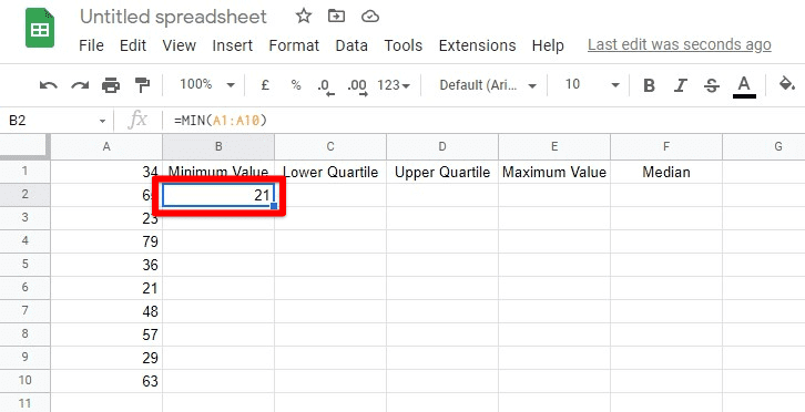
The minimum value
2. Calculating lower quartile value
Step 1: Select that particular cell inside the sheet to display the lower quartile value.
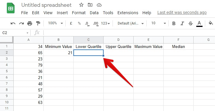
Selecting a cell for the lower quartile
Step 2: Type “=QUARTILE(A1:A10,1)” in the “Formula Bar”. Press the Enter key. Make sure to replace A1:A10 with the range of cells you are interested in.
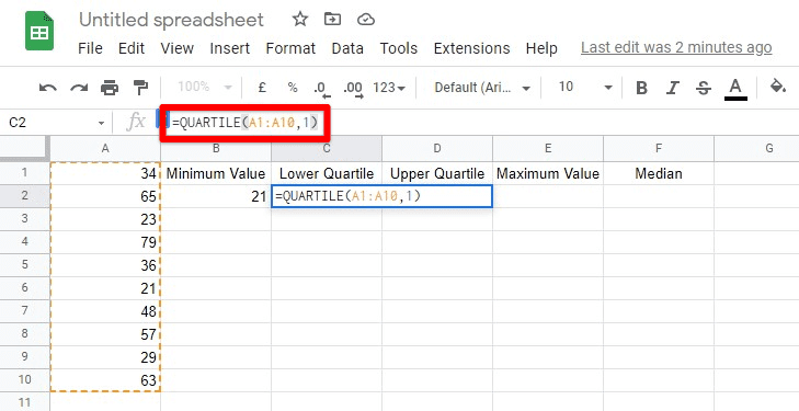
Implementing QUARTILE function for the lower quartile
Step 3: After you press the Enter key, the cell you selected will display the lower quartile of your data set.
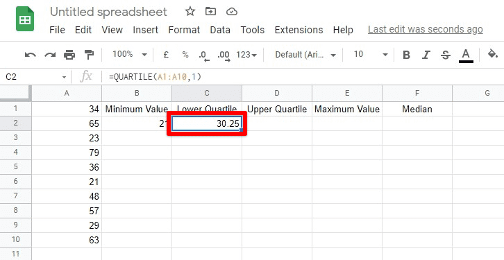
The lower quartile
3. Calculating upper quartile value
Step 1: Select that particular cell inside the sheet to display the upper quartile value.
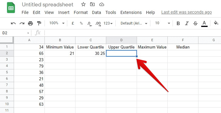
Selecting a cell for the upper quartile
Step 2: Type “=QUARTILE(A1:A10,3)” in the “Formula Bar”. Press the Enter key. Make sure to replace A1:A10 with the range of cells you are interested in.
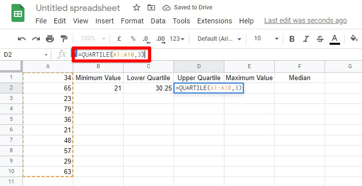
Implementing QUARTILE function for the upper quartile
Step 3: After you press the Enter key, the cell you selected will display the upper quartile of your data set.
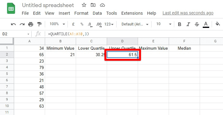
The upper quartile
4. Finding maximum value
Step 1: Select that particular cell inside the sheet to display the maximum value.
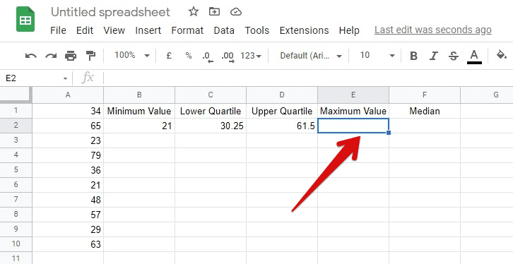
Selecting a cell for the maximum value
Step 2: Type “=MAX(A1:A10)” in the “Formula Bar”. Press the Enter key. Make sure to replace A1:A10 with the range of cells you are interested in.
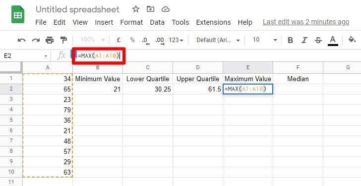
Implementing MAX function
Step 3: After you press the Enter key, the selected cell will display the maximum number from the entire set.
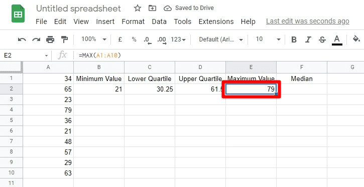
The maximum value
5. Calculating median
Step 1: Select that particular cell inside the sheet to display the median.
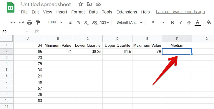
Selecting a cell for median
Step 2: Type “=MEDIAN(A1:A10)” in the “Formula Bar”. Press the Enter key. Make sure to replace A1:A10 with the range of cells you are interested in.
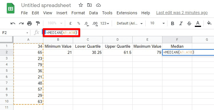
Implementing MEDIAN function
Step 3: After you press the Enter key, the cell you selected will display the median of your data set.
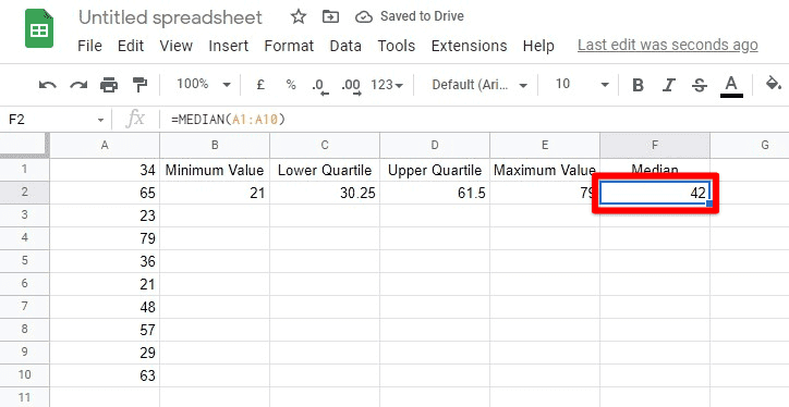
The median value
Drawing the Box and Whisker plot
After calculating all five values, the next step is to draw the plot. To do so, you will have to follow the subsequent steps,
Step 1: Click on an empty cell beside your descriptors and fill it with the title of your plot.
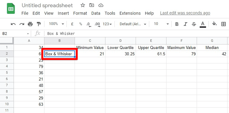
Plot title
Step 2: With your mouse, select the six cells that contain the title and the descriptor values.
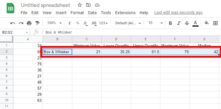
Selecting the title and descriptor values
Step 3: From the toolbar at the top, click on “Insert” and then go to “Chart” from the drop-down menu.
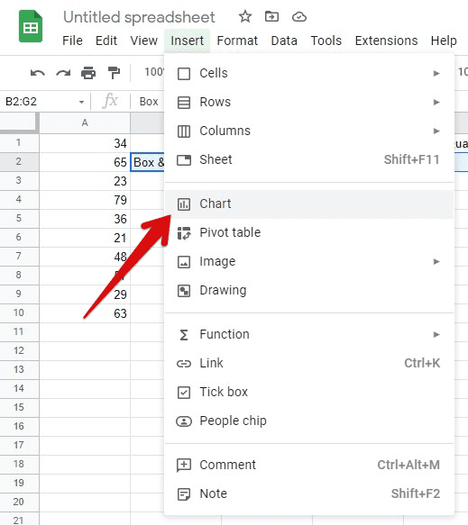
Insert chart
Step 4: This will open the “Chart editor” on the right side of your screen. From the “Chart Type,” select “Candlestick chart.” This will display your chart in a new window.
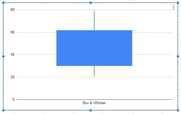
Box and Whisker plot
Note: If your chart window displays an error, try checking the “Switch rows/columns” checkmark at the very bottom of the “Chart editor.” Make sure to store your descriptor values in the same order as displayed in tutorial images. Otherwise, you will have to fill the entries in the editor manually.
You can skip the median calculation since we are using the candlestick chart as a replacement for the Box and Whisker plot. Therefore, this value is not used in the actual plot drawing. However, once the chart is displayed, you can locate this value by simply finding out the middle point of the box in your plot. It is only possible because the upper and lower bounds of the box are quartile values.
Conclusion
After successfully creating a Box and Whisker plot in Google Sheets, you can customize it however you want. This can be done with chart titles, axis titles, horizontal settings, vertical and grid lines. This is available inside the “Chart editor” under the “Customize” tab. You can also draw multiple Box and Whisker plots at the same time. This can be done by selecting multiple rows of descriptor values in one box and then inserting candlestick charts for all of them. This will draw individual charts in separate windows that can be set up and customized independently. Do not miss reading this article if you want to learn more Google Sheets tricks.
