Google Sheets is filled to the brim with helpful and important features that let you create in-depth spreadsheets for work and other professional use-cases. This includes finding and removing duplicate entries while being able to employ the IMPORTXML functionality just as well. In any case, if you’re a beginner, learning how to make a pie chart in Google Sheets is among the most important things to do as you’re getting started.
In the write-up at hand, we’ll explain how you can follow a number of easy steps to create a pie chart in the well-renowned spreadsheet creator. That way, you can replicate the process on your end and benefit from the desired results going forward. With no further ado, let’s get right into it.
Creating a pie chart in Google Sheets
Thanks to the swath of formatting options available in Google Sheets, the added expanse of in-app features makes it simple to create a pie chart, but you can’t get to that stage so easily without having the relevant prerequisites sorted first. Quite similar to creating a regular graph in Sheets, you first need to have data available in your spreadsheet to be able to create a pie chart for it.
No data, no party: Sort the prerequisite of creating a new pie chart
Having appropriate data on the Sheets file is your part of the job, whether you choose to type it all in or import it from another document, the process for which though is plain and simple, thanks to Google’s streamlining efforts. For those not in the know, there’s also a method involved for converting an Excel file into a Sheets document, should you choose to opt for that level of convenience.
Moreover, if you’re a new learner who is just trying to get into the ins and outs of pie chart creation on Sheets, feel free to opt for this site that hands out sample data for you to import into your Sheets file. As soon as you have your data together, you can proceed by using the “Insert” tool in the program. Let us explain how.
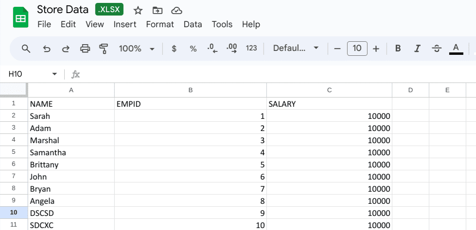
Data gathered in the Sheets file
Selecting the data to create the pie chart
The next step after fetching the data is to simply highlight it so you can implement the “Insert” function right away. Make sure to only select the data that you’d like to be shown in the pie chart that’s coming right up. Clicking on “Insert” should reveal multiple options on the screen, including “Chart.” Click on it to continue. Note that creating a regular chart first is the key to success here. We’ll change the category of the chart in one of the next steps.
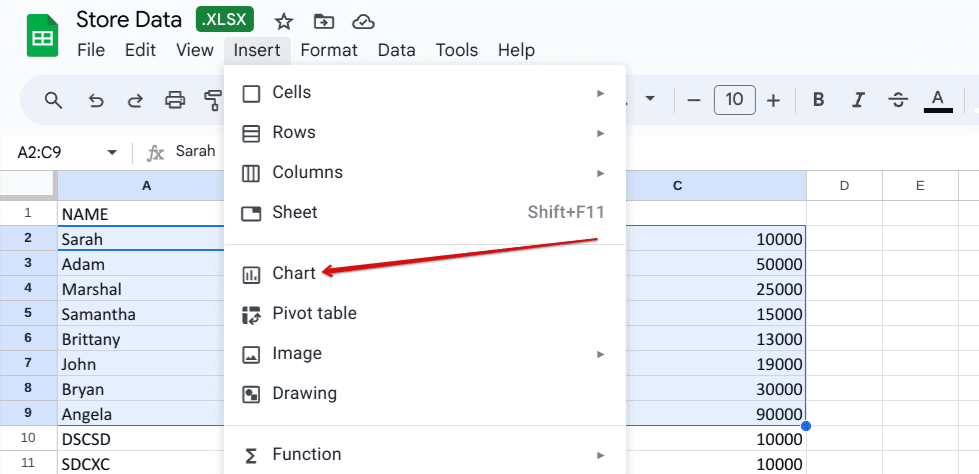
Creating a chart first
Editing the chart
After a brief moment, a chart will surface on the screen, comprising the data that you previously selected in the Sheets file. The next step is to either double-click on the chart, so a dedicated side panel can appear on the screen, allowing you to take things further, or simply use the “More actions” button present in the top-right corner of the chart. If you go with the latter route, choose the “Edit chart” option once you’ve clicked on the three vertical dots icon.
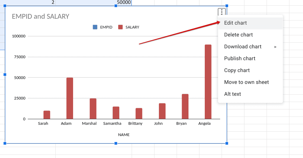
Editing the chart
Choosing chart type
You should be seeing a panel on the right side of the screen now. This is the “Chart editor” area that will let you go in depth for the purpose of chart modification. Under the “Setup” subsection, click on the “Chart type” dropdown menu, and numerous options should manifest straight away. Scroll down and find the “Pie” heading. From here, choose the pie chart option of your preference. The existing chart should be changed accordingly.
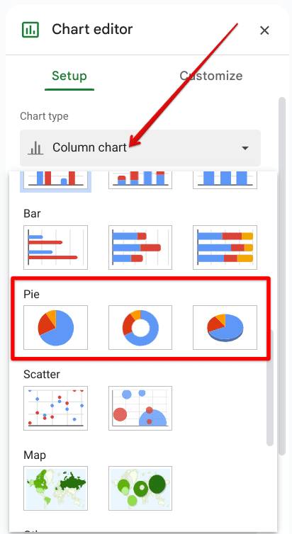
Choosing the pie chart of preference
Similar to how you can comprehend in the screenshot below, we now have a fully functional pie chart in Google Sheets. We decided to go with the “3D pie chart” variant because of its overall convenience and clean aesthetics. Now that you’re done with the basics here, the next step is a cautious step-into-light for the customization of the pie chart.
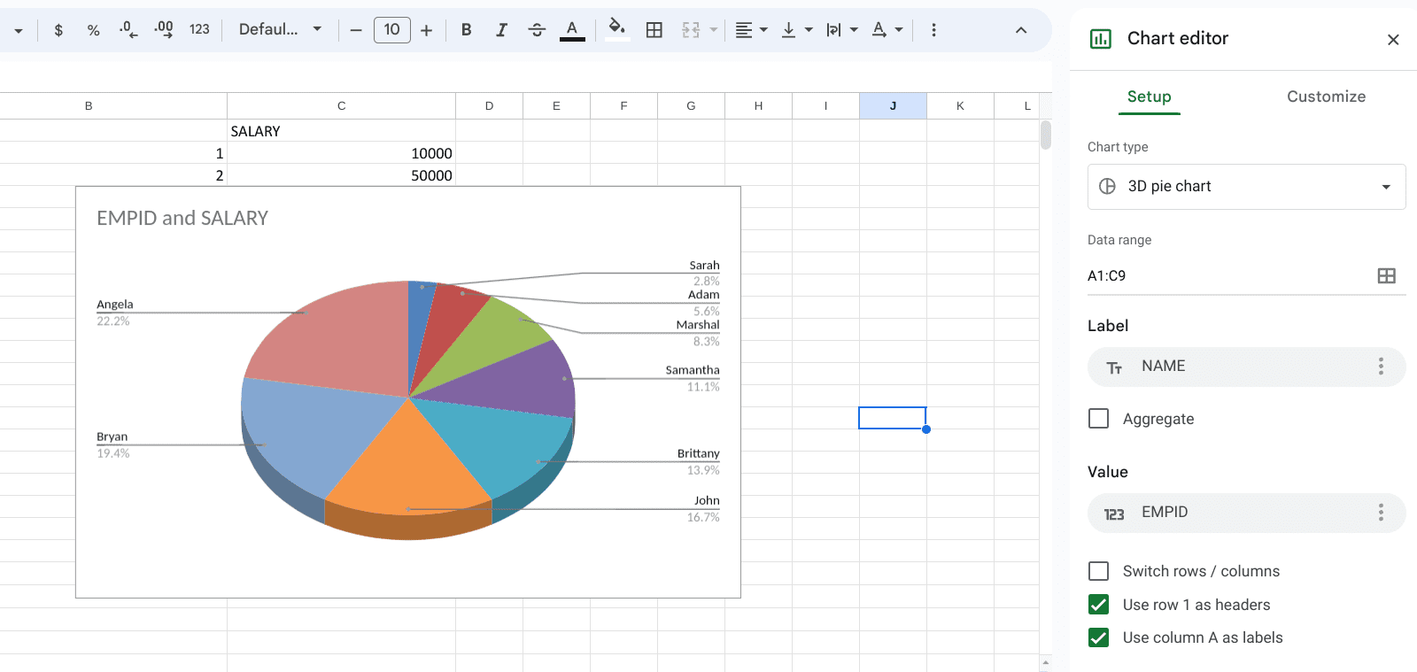
Pie chart created in Google Sheets
Customizing the pie chart as per your requirement
The “Chart editor” side panel is a feature-filled section that offers great editing potential for the charts you make in Google Sheets. You can actually utilize it to speed up your productivity rate and make changes to your chart on the fly without having to revisit the original data present in the Sheets file. Here is an overview of some of the things you can pull with “Chart editor.”
Adjusting the data range
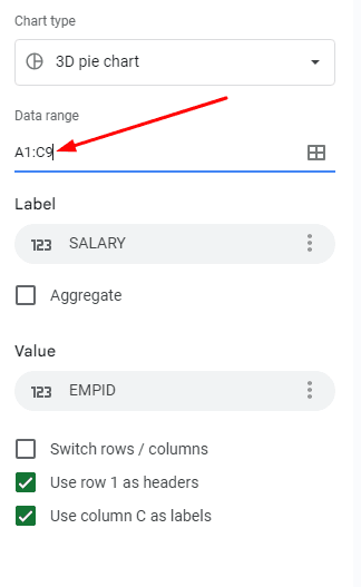
Changing the data range
First off, you don’t have to reselect your data in the Sheets file if you want to change the components of your pie chart. This can be done seamlessly via the “Chart editor” under the “Setup” tab. Click on the “Data range” bar and proceed to select the cells that you’d like to include in your pie chart’s data composition. The changes will take place in real-time.
Personalizing the chart
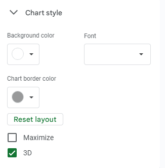
Changing the colors of the pie chart
Next up, if you don’t like the way your pie chart’s colors are organized, use the “Customize” tab to focus on “Chart style.” From there it’s easy to adjust the graph’s background color, followed by switching up its font style as well. Other options, such as switching between a 3D and 2D layout, and designating a specific border color for the chart are available as well.
Adjusting the pie chart’s specifics
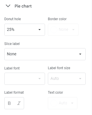
Changing the pie charts parameters
Next up, you’ve got some specific settings relating to your pie chart, and honestly, this is where things start to get exciting and deep-dyed. The first setting underneath the “Pie chart” section is about creating a donut hole in the chart. You can choose a percentage for the size of the hole, and that will take care of the edits accordingly. Additionally, the option to pick labels for each slice of the pie chart is available as well, along with being able to adjust the label’s font, size, and format.
Trying out the “Pie slice” feature
This is a personal favorite feature of ours to persist within Google Sheets’ pie chart creation. Right under the “Pie slice” subsection, shed some light on the “Distance from center” button, and specify a percentage there. Even if you choose the lowest option, which is 25%, you’ll immediately notice one portion of your pie chart pulling away from the central area, or hole if you’ve created one in there. This yields greater clarity over some distinct parts of your chart. Make sure to employ it wisely.
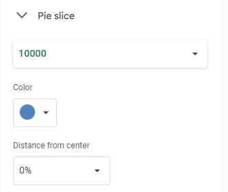
The Pie slice feature
Using the “Chart and axis titles” feature
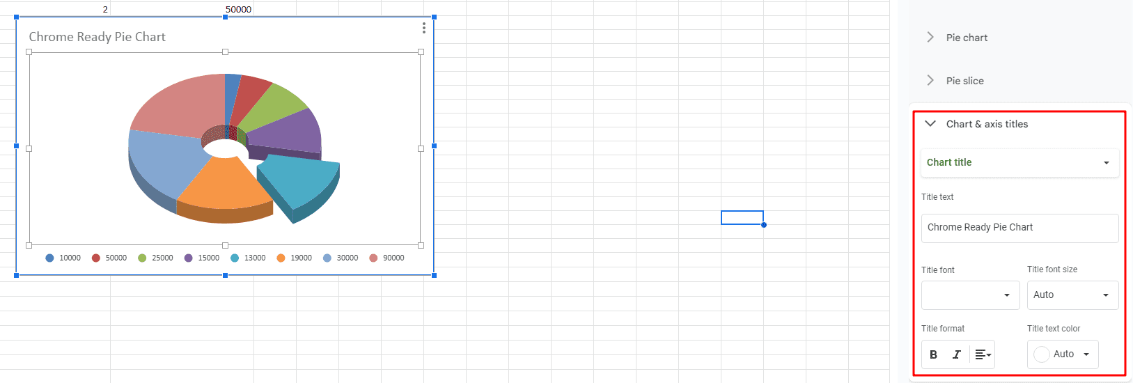
Giving the pie chart a title
Last but not least, there’s the “Chart and axis titles” functionality that can seemingly allow you to title your pie chart, like we have in the screenshot above. You can choose the text as per your preference, pick its font, size, and color—the usual bit—and incorporate it into the chart as per your preference.
The combination of these features results in a high-quality chart
We recommend practicing with all that the “Chart editor” offers for aspiring new Sheets users. There are also some great YouTube tutorials out there for those who are looking to get on the level of experts, so we recommend pursuing that path as well.
Conclusion
As depicted by the write-up above, creating a pie chart in Google Sheets is akin to making a graph in the spreadsheet creator. A handy set of instructions should help you get started on the right track, as this article has guided you to do so. Just make sure to fill in the relevant data as accurately as you can for the best results. Let us know in the comments ahead if you found the guide useful on your end.
A comment would be much appreciated. Thanks for reading!
