From being able to make a budget spreadsheet in Google Sheets to being able to disable the in-app people chips feature, the platform in question has stayed utterly resourceful over the years for its productivity and workflow maintenance. However, if you’re just getting started with the spreadsheet creator and aren’t quite sure about how to make a graph, let this guide serve as a one-stop-shop write-up for your easy understanding.
In the article ahead, we’ll talk about making a graph in Google Sheets in a number of easy-to-follow steps, so you can replicate the instructions painlessly on your end. Let’s get started with no further ado.
The simplest way to create a graph in Google Sheets
To put things into a simple perspective, creating graphs is as easy as pie in Google Sheets, but before you get started, you should know that graphs are derived from data. Without enough data, you cannot successfully manifest a graph, so take care of this facet first prior to moving forward. On the other hand, if you already have your data present on your Sheets file, skip to the section after this one, since the next part is for beginners only.
Getting the data part sorted in Google Sheets
Pro tip: If you wish to open up a Sheets document as soon as possible without having to navigate to the Google Sheets website first, simply type “sheets.new” into the URL bar and press the “Enter” key. That should do the trick. Once you have a fresh draft opened up, use the cells to type in your data or import it if possible. Just so you know, there exists a powerful tool in Sheets called the IMPORTXML function. You can use it to fetch data from any website. Check it out for more details.
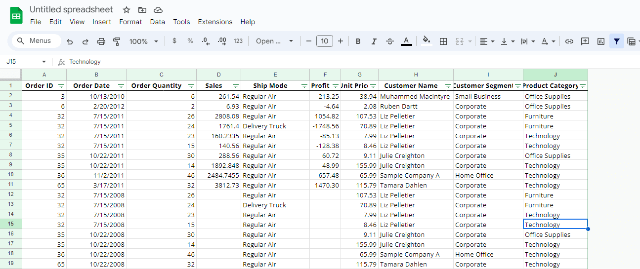
Readying the Sheets file for graph creation
Turning the data into graph format with an easy few steps
Right, so now that you have your data sorted, the next step is to go ahead and lay it out in graphical format. To do this, select the cells that you’d like to use for your graph using your cursor, and click the “Insert” button on the toolbar at the top. That should reveal multiple options on the screen for you, including “Chart.” Click it and a graph should appear right away on the screen for you.

Creating a graph in Google Sheets
Tweaking the initial settings of the graph
Remember that the clarity of the details present in the graph in Google Sheets depends on the accuracy of your data. Try not to make it convoluted or anything of the sort—keep it clean and meaningful. Otherwise, the graph could suffer from specificity issues. Anyhow, once you have your graph on the screen, you should give it a little resize to make it fit just the way you want to on your Sheets document. The scales on each corner of the graph are going to help you in this regard.
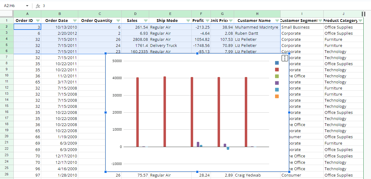
Chart created in Google Sheets
How to edit your graph in Google Sheets
Creating a graph is relatively easy, but it’s the editing part that can often rile users up. Thankfully, Google Sheets has a robust mechanism in place that makes it possible to make easy edits to graphs on the go, without having to delve into too much detail. You can begin by double-clicking on the chart and then selecting the “Edit chart” button.
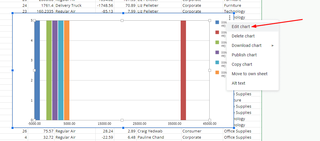
Editing the chart in Google Sheets
Personalizing the graph
Once you complete the previous step, you should start with the “Customize” segment of the side panel that will appear on the screen now. Doing so will offer a much better first impression with regard to the overall complexity of the matter. Under the “Customize” wing, a slew of options are available for you to get into, starting with “Chart style.” This is where you can personalize your graph’s colors and even toggle the maximize setting.
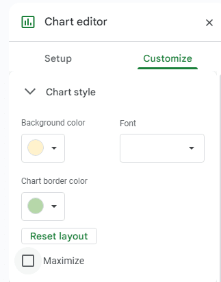
The “Chart style” section in the Customize panel
Histogram, titles, and legend availability
As it has turned out, the customization of your graph in Google Sheets is far more involved than what meets the eye initially. Scroll a little further down the list and you’ll come across a range of other personalization options as well, such as “Histogram,” “Chart and axis titles,” and “Legend.” Each function here plays an important role in changing the overall outlook of the graph you’ve designed in Sheets.
Histogram can add dividers
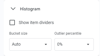
The Histogram setting
If you want to add divisions in your Google Sheets graph, the Histogram function is the tool to go after here. Simply click the toggle that stays “Show item dividers” and you’re good to go. To specify the outline even more, you can tweak the “Bucket size” feature and the “Outlier percentile” option as well. If you’re a beginner, best leave “Bucket size” to “Auto” and “Outlier percentile” to “0%.”
The titles section switches up the subheading size
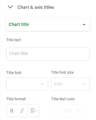
Chart and axis titles
The “Chart and axis titles” section is a great way to add more depth to your Google Sheets graph. Choose the type of title that you’d like to designate from the “Chart title” dropdown menu and select the appropriate “Title text” to proceed. The font and the font size, along with the format, and the color of the text are all tangible parameters here. Feel free to customize them as you see fit.
Adjust the legend for better visibility
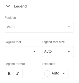
The Legend feature in Sheets
Finally, the “Legend” space has a lot to do with the orientation of your graph, and we deem it an important function to be wary of as you proceed. The contents of the graph can have their format, and size changed in this particular menu, given how you’ve got the font size and text color options as well to amplify the outlook of your graph in Google Sheets.
Conclusion
Crafting graphs in Google Sheets is a painless process, all you need to have is the right know-how, and that should do the trick. Graphs are of various nature in the Sheets application, so to tone down the difficulty or the complication of the process, you have to determine the type of graph that you’re making ahead of time. As such, this article has laid out the principle guidelines required to manifest a graph in Google Sheets, and you should now be well aware of how to whip one up whenever you want.
Let us know in the comments ahead if you found the guide useful on your end. A comment would be much appreciated. Thanks for reading!
