Google Sheets’ practicality makes it stand out as one of the best productivity applications in Google’s desktop suite, otherwise known as Workspace. It’s loaded to the brim with features, but sometimes, understanding what tools you can utilize and make the best of can be difficult, especially if you’re a new user. The same is the case with error bars in Sheets that allow you to set a specific margin for error in your charts or graphs.
If you’re out to make meaningful spreadsheets with detailed, insightful elements embedded in them, you cannot skip past the convenience of error bars. In this guide, we’ll explain how you can get things up and running with this particular functionality of Google Sheets so it’s easier to replicate the process on your end. With no further ado, let’s get started right away.
Creating error bars in Google Sheets simplified
One of the main features of Google Sheets is that it lets you create charts while staying flexible about it. So, to begin delving into error bars, we first need to understand where precisely an error bar is applied. That’s because using an error bar in Sheets is impossible without first addressing the fundamentals. Let’s explore this with a bit more depth ahead.
The prerequisite of implementing error bars in Sheets
First, you should know that the application of error bars is exclusive to charts in Google Sheets. If you’re not sure how to create one, please refer to our guide on how to make a chart in the Sheets app for detailed information. It’s straightforward; the gist is to have relevant data arranged in the Sheets beforehand and then use certain tool buttons to craft the chart right there and then. Feel free to experiment with different chart types yourself if possible.
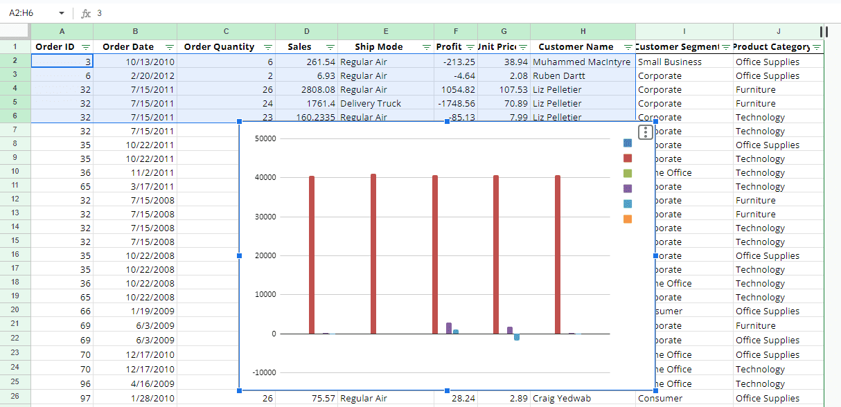
A basic chart in Google Sheets
Applying an error bar to a created Sheets chart
We picked up an earlier tip while tinkering with Google Sheets’ chart creation: Don’t try applying error bars to a pie chart; it won’t work. Pie charts serve different purposes, and if you want to learn how to utilize them properly, this write-up should guide you nicely. So, what working steps allow one to incorporate error bars in Sheets? We thought you’d never ask.
Step 1. Select your chart to bring up the Chart Editor
With your chart in central focus, double-click on it to bring up a specialized side column to the right side of the Google Sheets interface. This area allows you to modify charts and graphs in the application. Alternatively, you can also click the “More actions” button on your chart and select the “Edit chart” option. That should do the trick just as well.
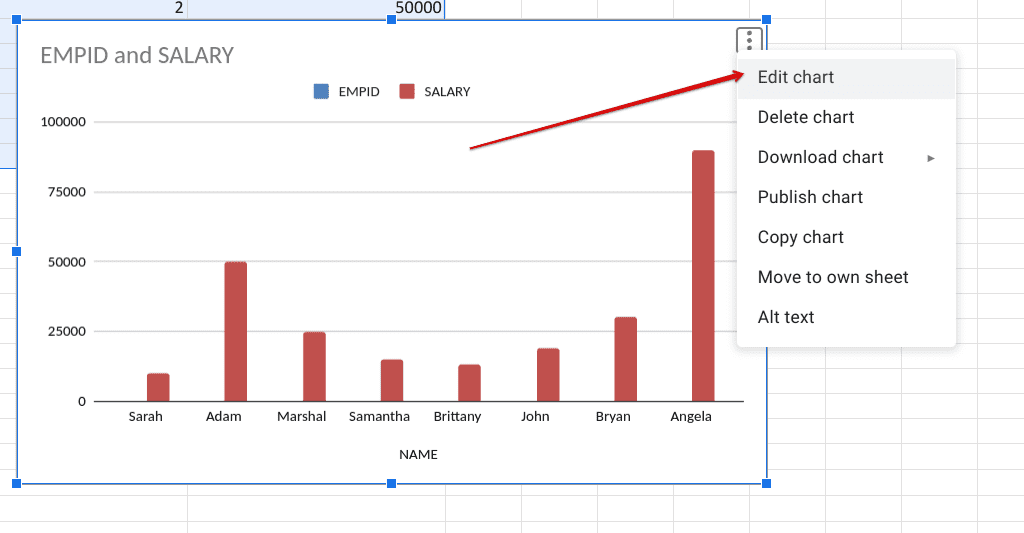
Editing the chart
Step 2. Choose the “Customize” tab
As you complete the previous step, look to the right in the user interface of the Sheets app and select the “Customize” tab. By default, it will be set to “Setup.” Change that right away.
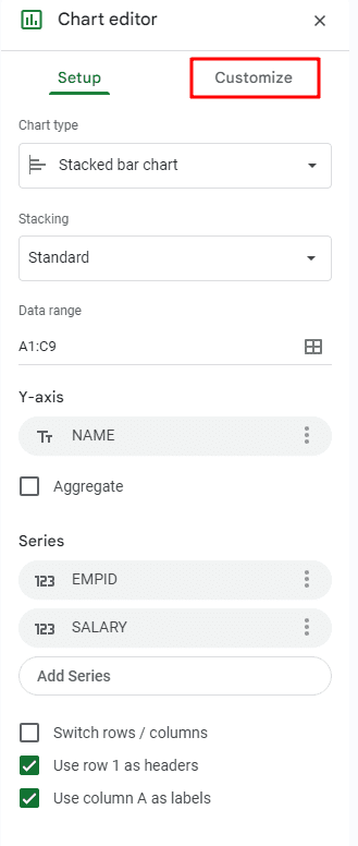
Selecting the Customize tab
Step 3. Click on the “Series” section
Moving ahead, the “Customize” tab will list an array of additional options for you, including Chart style, Chart and axis titles, Legend, and more, but those hardly concern us. Look for the “Series” section to proceed to the next step.
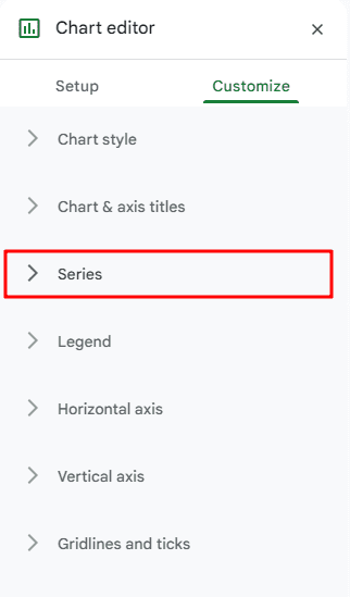
Expanding the Series section
Step 4. Click the “Error bars” checkbox
Finally, after expanding the “Series” area under the “Customize” section, look for the “Error bars” checkbox in the lower section of the feature. Hint: If you do not see the “Error bars” tool here, use the wrong chart type. Go to the “Setup” tab, and choose anything out of “Line,” “Area,” “Column,” or “Bar” from the “Chart type” option to see if that makes a difference.
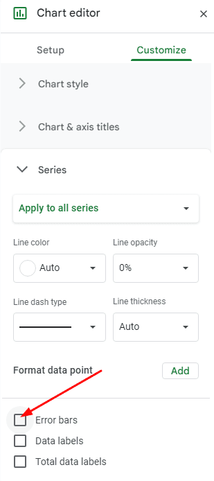
Enabling error bars in Google Sheets
Step 5. Customizing error bars in Sheets
Now that you have enabled the base error bars functionality, it’s time to tweak the feature’s ins and outs and attempt to receive different results accordingly. To begin with, the default “Type” option selected is “Percentage” with a value of 10. If you click the dropdown menu and set it to “None,” the error bar seamlessly disappears from your Sheets file. However, following the previous step, you can revert the change anytime you like.
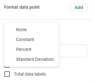
Error bar types in Google Sheets
Error bar types and their representation
Taking a closer look into the functionality in question, there are three other error bar types in Sheets other than “None,” as shown in the drop-down menu of the “Type” option. Each category has its representation for your chart in the Sheets app; let’s check them out ahead. For reference, we will use the value of 25 for all our error bars ahead.
Constant
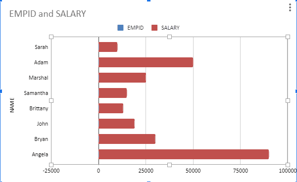
The Constant error bar type in Sheets
The “Constant” error bar type is an easygoing approach to using an error bar for a graph in Sheets. It utilizes your priorly entered numeric to highlight the lowest and highest extremes of the value.
Percentage
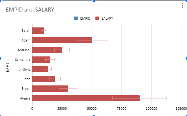
The Percentage error bar type in Sheets
The “Percentage” error bar type is self-explanatory, as it takes the numeric value and shows a percentage of the upper and lower ranges across your entries in the Google Sheets graph.
Standard Deviation
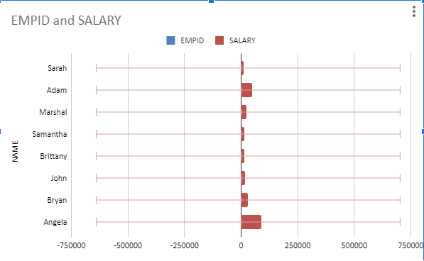
The Standard Deviation error bar type in Sheets
Finally, there’s the “Standard Deviation” error bar type, which first requires the numeric value incorporated from the Chart editor side panel to emphasize the error bars in the middle of the graph. It certainly offers a different perspective for analyzing your data, keeping a safe margin for potential inaccuracy in the numbers.
Conclusion
Google Sheets has proven to be a beneficial program over the years. It is renowned for its reliability, expansive tool set, and cloud connectivity. It sports multiple use cases, such as making a budget spreadsheet to manage your finances and generating a QR code for other purposes. For those requiring advanced formatting when creating pie charts, error bars should help you get a decent average.
In this guide, we’ve shown you the correct implementation of an error bar, which begins with creating a chart in Google Sheets. Do comment down below and tell us what you
