Google Slides is one of the major constituents of the Google Workspace suite. The latter is a full-scale desktop productivity program comprising a bundle of other like-minded software, such as Google Docs and Google Sheets, to facilitate individuals and businesses worldwide. Slides is oriented toward presentations and serve as the direct counterpart of Microsoft PowerPoint, which is another major power player of the Microsoft 365 suite.
Although all of Google’s productivity products are easy to use, it can be helpful to know the ins and outs of this software beforehand so that when it comes to putting in the work, you’re already trained and ready to go in a much more professional way. In this guide, we will go over Google Slides in detail, covering everything you need to know about it from a beginner’s perspective. The forthcoming tutorial will encompass the user interface and the basic working of Google Slides.
Let’s get started without any further delay.
- It’s also worth checking out a similar beginner’s guide to Google Docs in 2023 for the best results.
What is Google Slides?
Google Slides is a well-grounded slideshow creator that has gained immense popularity over the years. It sports multiple features to help users create slides, pictorial representations of a particular topic, made to illustrate and present a specific subject. Slides come bundled as part of Google Workspace but can also be used individually for free. Workspace is a platform that comprises a set of highly curated applications that have been developed to meet certain use cases.
For instance, Google Docs is a word processor that revolves around writing and editing text. Another example is Google Sheets, which is concerned with creating and developing spreadsheets. Being affiliated with Google Workspace means that Slides users and individuals who use any other Workspace app can painlessly enjoy robustly collaborative features and integration between other Workspace constituents.
For instance, Google Docs, Google Calendar, Google Sheets, and Google Slides can all collaborate with Google Meet for instant video conferences wherever needed. That’s the whole ecosystem that Google has created for its user base. As for Slides, the program was first released in 2007 as Google Presentations, and Google Docs accompanied it.
Following further developments and refinement of the software, Google Presentations was converted to Google Slides. The new computer app boasted more features than ever with a fresh re-design of the graphical user interface. Similar to Google Docs, Google Slides is browser-agnostic. It does not matter whether you’re using Google Chrome, Mozilla Firefox, Safari, Opera, Brave Browser, or any other internet browser to surf the internet.
As long as you have an internet connection, you’ll be able to use Google Slides without breaking a sweat. Moreover, there’s the added ability to work with files offline, but you must enable that feature for files first. Google Slides’ cloud-oriented nature brings the major benefit of auto-saving your progress on the go without having to delve into the process manually.
In addition, the program is compatible with a variety of different file formats, including PPT, PPSM, PPSX, SVG, POT, and others. Regarding using Google Slides to work with Microsoft PowerPoint, the developers were thoughtful enough to include PowerPoint support as part of Slides’ skill set. Therefore, if you’re coming from Microsoft Office’s ecosystem, you’ll find comfort in welcoming you with open arms on Google’s side of things.
Let’s get right into Google Slides’s working mechanism and how to start with it without delay.
Getting started with Google Slides
Beginning your work with Google Slides is a painless process. Since the slideshow maker can be accessed from any internet browser with a stable connection, all you need to do is head over to the official Google Slides website, click here, and you’ll instantly be transported to the main Slides menu interface. From there, it’ll be possible to choose your base template and start working on your slideshows immediately.
To get started, therefore, visit this direct link to get straight to the Slides web handle. Then, click on the “Go to Slides” button afterward to launch the Slides main interface page. You might be prompted to sign in with a Google account if you haven’t done that.
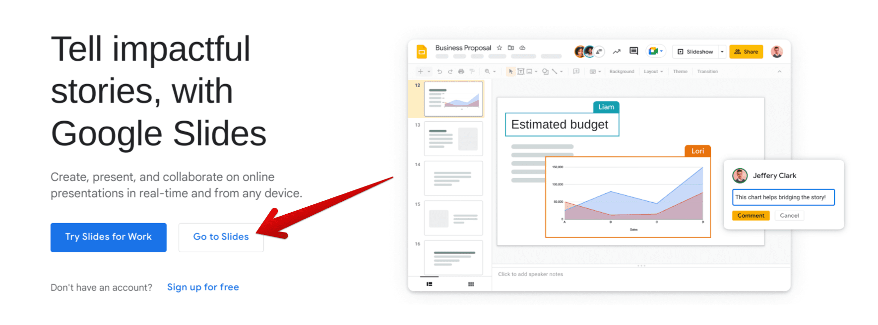
Clicking on “Go to Slides”
The main “Google Slides” page will now appear on your screen. You can now start a blank presentation by clicking on the relevant button. That’s about it as far as getting started with Google Slides is concerned.
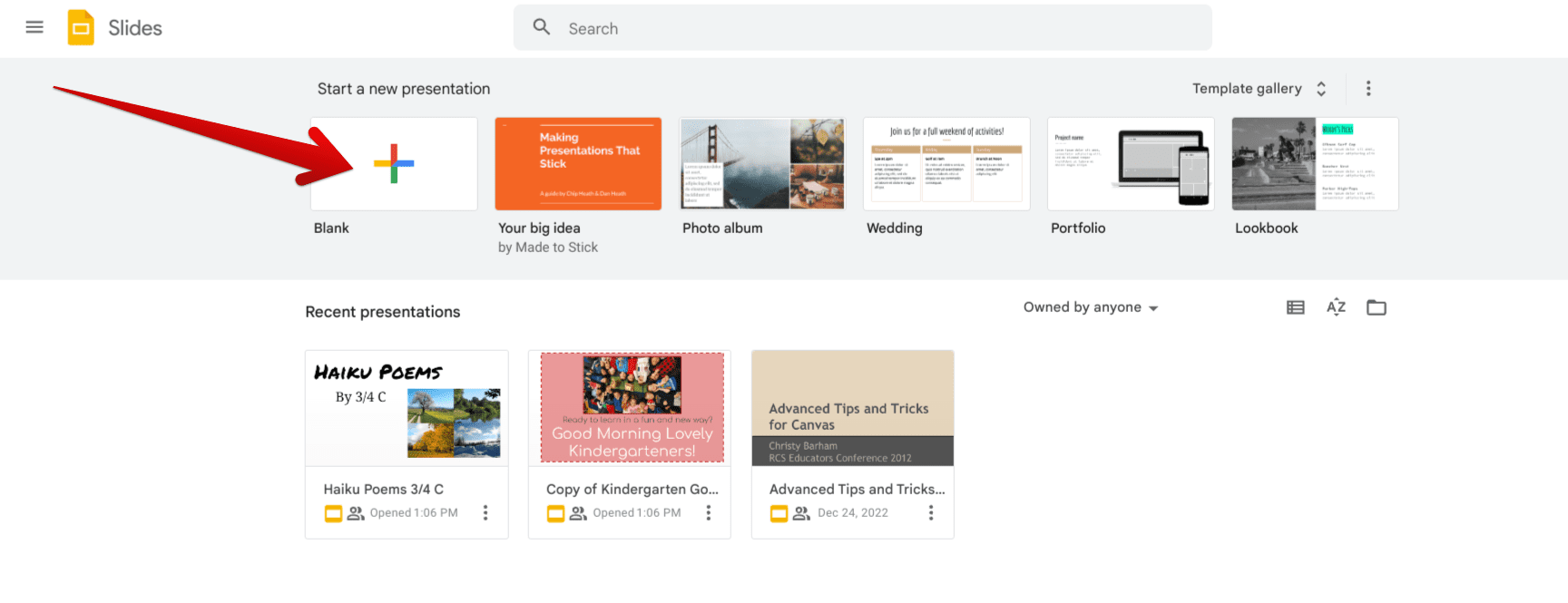
Starting a blank Slides presentation
We are now aware of how you can get started with Google Slides. Let’s now dissect its user interface and figure out how to get the best out of Slides for the coming days.
Working interface of Google Slides explained
Primarily, Google Slides’ interface is undoubtedly not something you’ll struggle with, even if you’re a newbie just starting. The various design elements of the application’s GUI are laid out so quickly that it won’t take long to understand how the Slides program works, no matter if you start tinkering all by yourself. Nevertheless, we will still detail the basics of Google Slides in a step-by-step manner in this section.
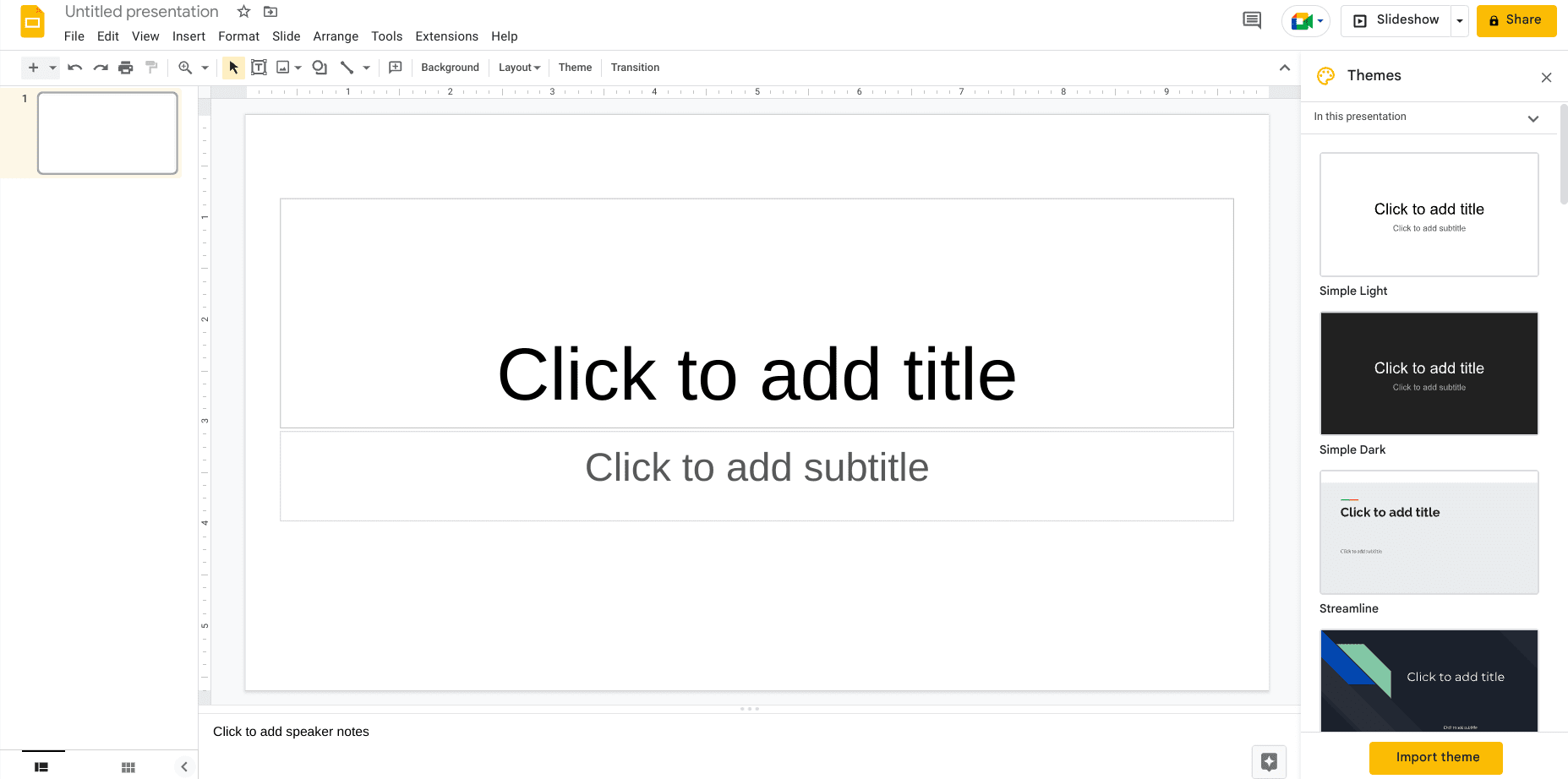
Google Slides’ main interface
First, the screenshot you see above represents the primary interface area of Google Slides. As you can comprehend, two sizable bars prompt you to click on them so relevant titles and subtitles can be added. We won’t be jumping in just yet, since a fair bit of information needs to be absorbed before that. After mastering the basics of the Slides app, you can then learn more advanced tips and tricks.
Picking a theme for the Slides presentation
Assigning a theme to your Google Slides document is one of the essential parts of creating a presentation. Usually, you have to choose a theme that aligns with the focus of your presentation. For instance, if the topic you’re presenting revolves around a disease, a theme that pertains to medicine will come across as suitable.
It’s worth mentioning that a presentation’s appearance matters immensely in front of an audience, and there’s nothing more important than the “Theme” feature for helping you come forth with the right image of yourself. Thankfully, Google Slides sports a built-in tool to help us pick a suitable theme. If the “Themes” side panel does not appear to the right of the screen as soon as you open a blank document, you can click on the “Theme” button in the toolbar to make it appear.
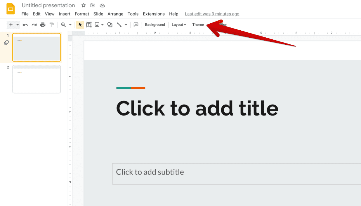
Clicking on “Theme”
You should now see the “Themes” side panel surface on the screen. Here, feel free to scroll through the vast array of different themes and choose one accordingly. You’ll now make your presentation gracefully stand out from this point onward.
Do note that once a theme has been applied, it will apply to all of your slides in the presentation to ensure one continuous flow of graphics. Furthermore, it’s essential to know that you can import themes to Google Slides and make customized additions to your files.
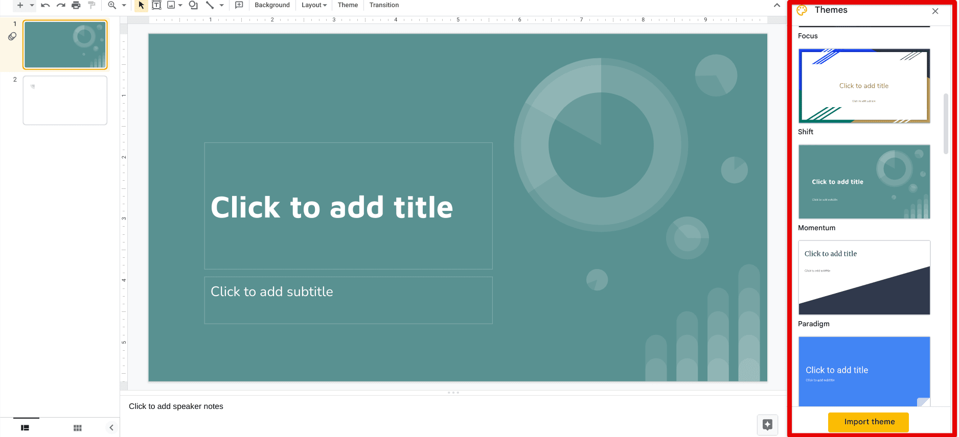
Using the “Themes” feature in Slides
Adding a new slide
A presentation consists of multiple slides, and your Google Slides file rarely will only comprise a single slide. That is why you should know how to add new slides in the editor interface to expand your content and add more depth to the presentation. Click on the “New slide” button in the top-left corner of the Slides interface, and that’ll do the trick.
The shortcut key combination of “Ctrl” followed by “A” for adding a new slide is also available on the fly. You can repeat the process as often as you’d like, provided that you’re filling each slide up and not leaving any entry empty.
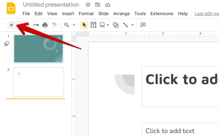
Adding a new slide in Google Slides
Choosing the right layout
Applying a suitable theme to your presentation will push you in the right direction—that’s for sure, but that isn’t where you top things off. We’re just getting started with Google Slides. The next logical step is to decide the layout you will use in your presentation. We recommend keeping your first slide as the “Title slide.” That way, you will be able to properly introduce not only yourself but the topic that you’ll be presenting as well.
To choose a layout for a slide, click on the dropdown arrow right beside the “Add new slide” button that’s symbolized by a “Plus” icon. Once done, a small menu will appear in that area, allowing you to select the layout that you’d like your slide to have. Do note that choosing a design won’t apply your picked layout to all the slides created in your presentation. Each slide will need to have its layout picked separately.
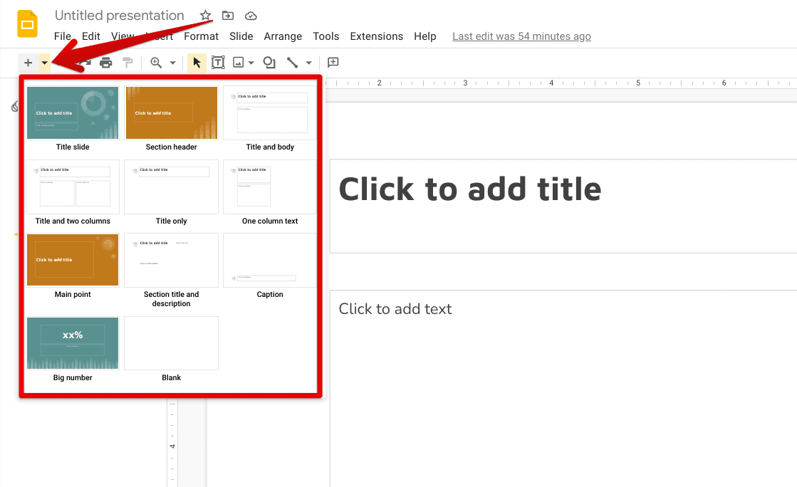
Choosing the layout of the slide
Renaming the presentation
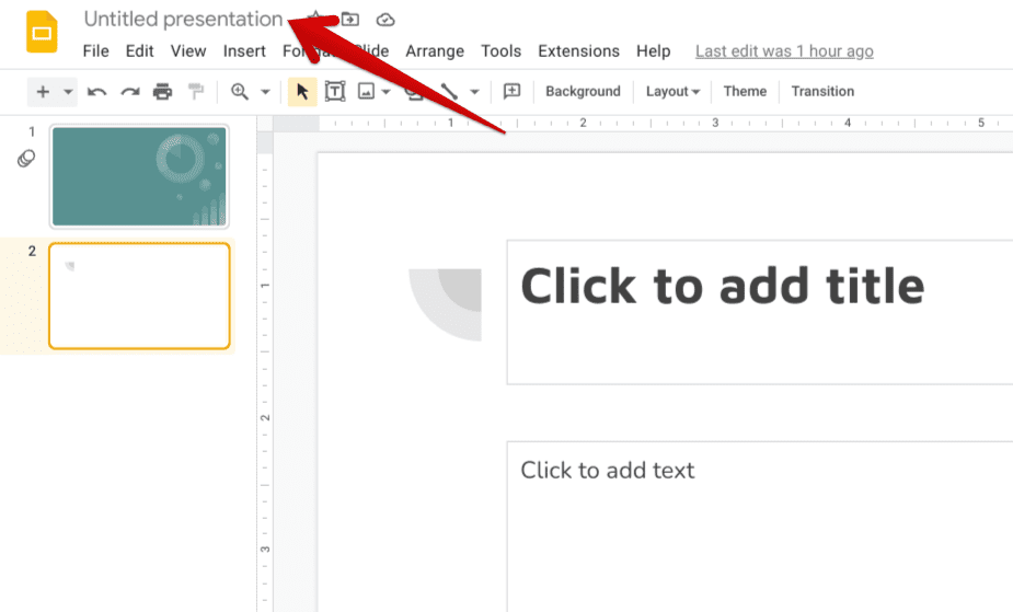
Renaming the Slides file
It’s advisable to give your presentation a different name than the default selected title of “Untitled presentation.” To do this, click on the “Rename” bar in the upper-left section of the screen. Type in whatever you’d like to rename your Slides file, and press the “Enter” key to finalize. Google Slides lets you enter special characters and symbols in your file’s name, whereas Microsoft PowerPoint does not boast such a nifty little feature.
Inserting a text box on a blank slide
Some of the most noteworthy Slides presentations come when you take matters into your own hands and experiment with customized slides. For this purpose, you will first need to learn how to add blank slides in the Slides editor that do not feature any pre-determined text box. Next, click on the dropdown arrow shown in the “Choosing the right layout” section to create a list of different layouts. Select “Blank” afterward to continue to the next step.
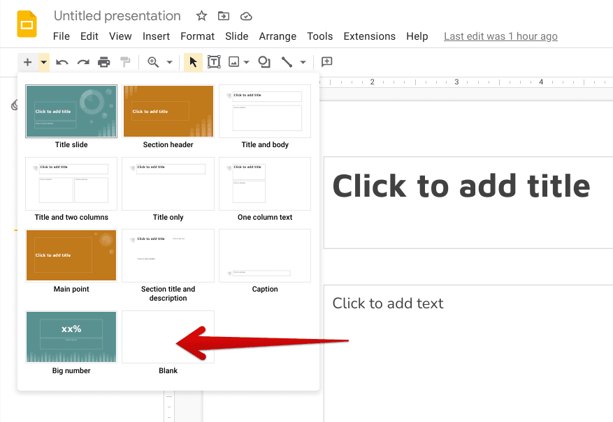
Choosing a “Blank” slide
Now that you’ve added a blank slide to your presentation, it’s time to modify it. Begin by inserting a text box in the blank slide. The “Text box” feature in the toolbar must be pressed to proceed from here on out. As you click on the button, you will observe your cursor changing its shape and allowing you to insert the text box in the blank slide by clicking, holding, and dragging the cursor on the slide. The size and shape of the text box will depend on your cursor’s movement.
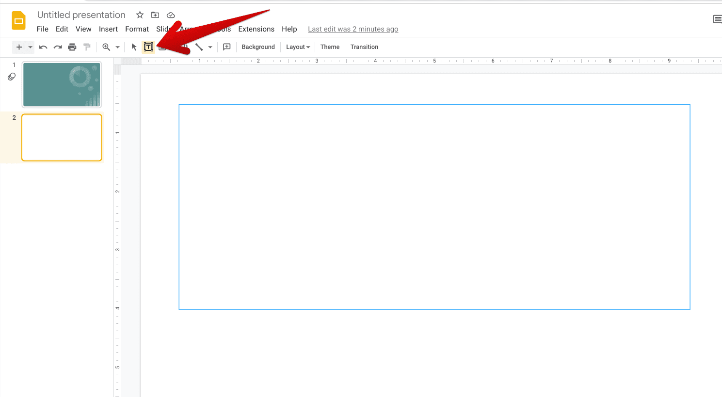
Inserting a text box in Slide
You can now freely write within the inserted text box. Although you will notice that the initial length of the box won’t appear as per your instructions, you will find the box stretching as you type into it automatically, so that’s not going to be an issue.
Uploading an image to Slides
The involvement of images accompanies the insertion of a text box in a blank slide. That’s because no presentation is complete without graphical references, and images help get the job done. We highly recommend uploading relevant and authentic images to your Slides presentation for a document that stands out from its competition. Click on the “Insert image” button in the Slides interface’s toolbar to get started here.
Quite luckily, Slides offers multiple different ways to upload images. You can choose from using your computer’s local storage, searching the web, using Google Drive or Google Photos, inserting a URL of the photo, and even taking a snapshot from your device’s camera.
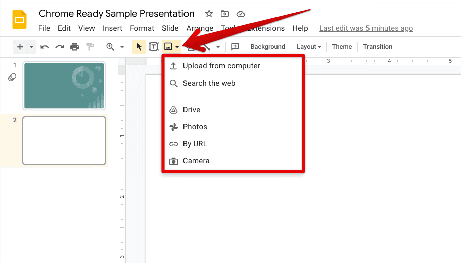
Uploading an image to the Slides document
Changing the view type
You can change the way you view your slides in Google Slides. Your available options range from “Grid” and “Filmstrip.” Click on either button in the top-left corner of the editor interface of the app to make the switch happen accordingly. The “Grid view” lets you visualize all of the slides you’ve created in the Slides document at a glance. On the other hand, the “Filmstrip view” is where you’ll be editing and viewing the presentation as a whole.
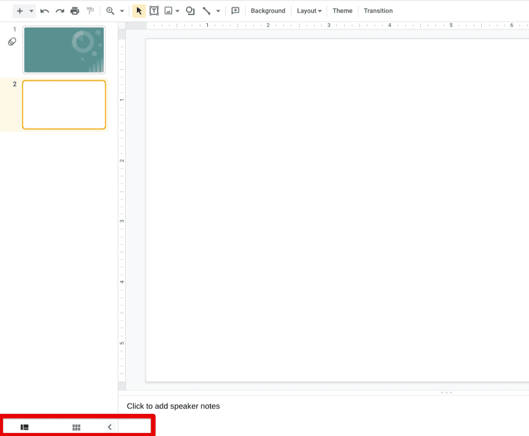
Changing the view type in Slides
Choosing a custom background
If you’re not running a singular theme in Slides and would like a fully customized Slides presentation, then you’ll be using a mix of inserting blank slides and customizing their backgrounds. Now that you are already aware of one-half of this equation, it’s worth talking about how to apply a custom background to your slides in the Slides application. So get rolling with the operation by clicking on the “Background” button in the toolbar located just to the left of “Layout.”
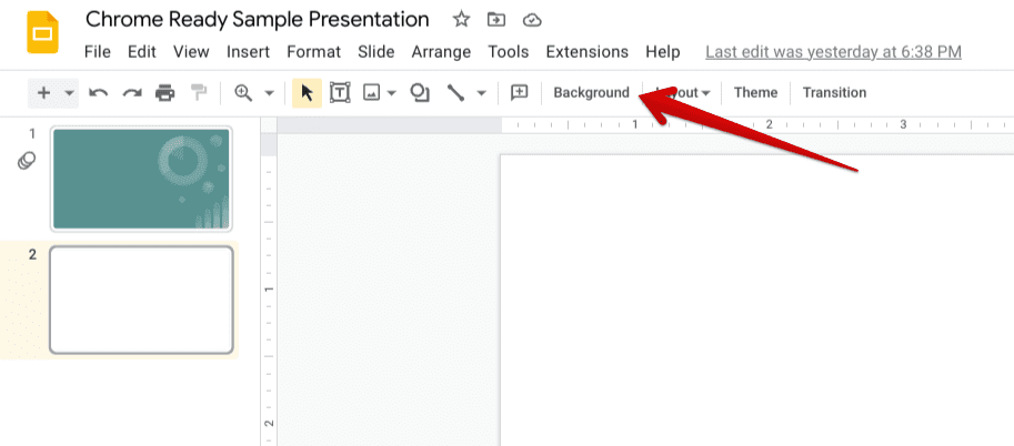
Clicking on the “Background” option
Completing the previous step will make a small window pop up on the screen, making it possible to modify the color and the image of your slide’s background. There are multiple options in the “Color” section, and you’ll surely need to spend a fair bit of time developing the best color scheme for your presentation.
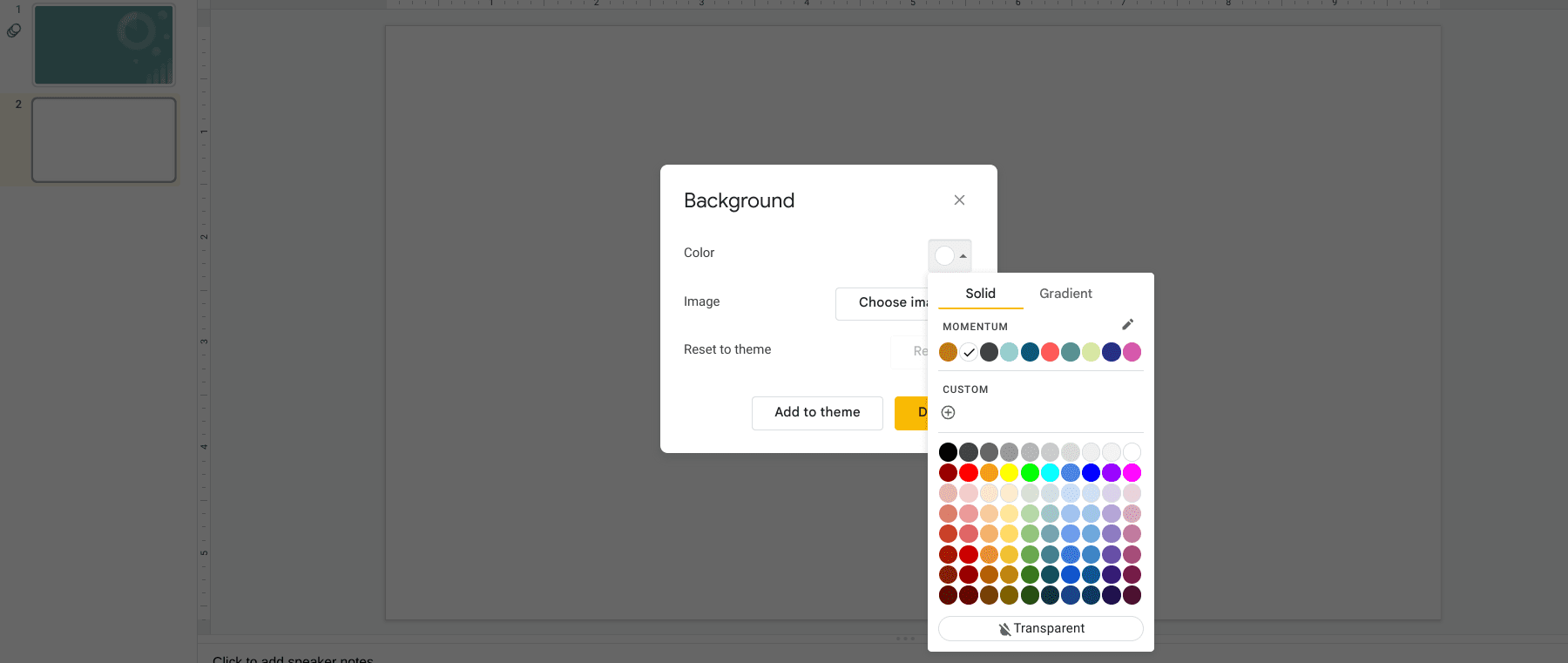
Tweaking the background of the slide
Using the “Slideshow” functionality
When you feel ready to preview your presentation, the “Slideshow” feature will come in handy. This functionality lets you view all of your slides one by one, so your presentation flows continuously and comes across as professional for your viewing audience. The “Slideshow” option rests in the upper-right area of the screen and can be employed with a shortcut key combo of “Ctrl,” “Shift,” and “Enter” as well.
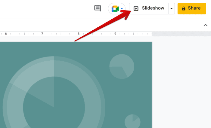
Clicking on the “Slideshow” button
Picking the slide transition
You can modify the transition with which your slides appear on the screen during a slideshow. Click on “Transition,” which is right beside the “Theme” button, and you’ll observe a dedicated menu on the right side of the Slides user interface. Here, it’s possible to tweak the type of transition you want for your slides to exhibit. Your options range from Dissolve, Fade, Flip, and Cube to Slide from right, Slide from left, and Gallery.
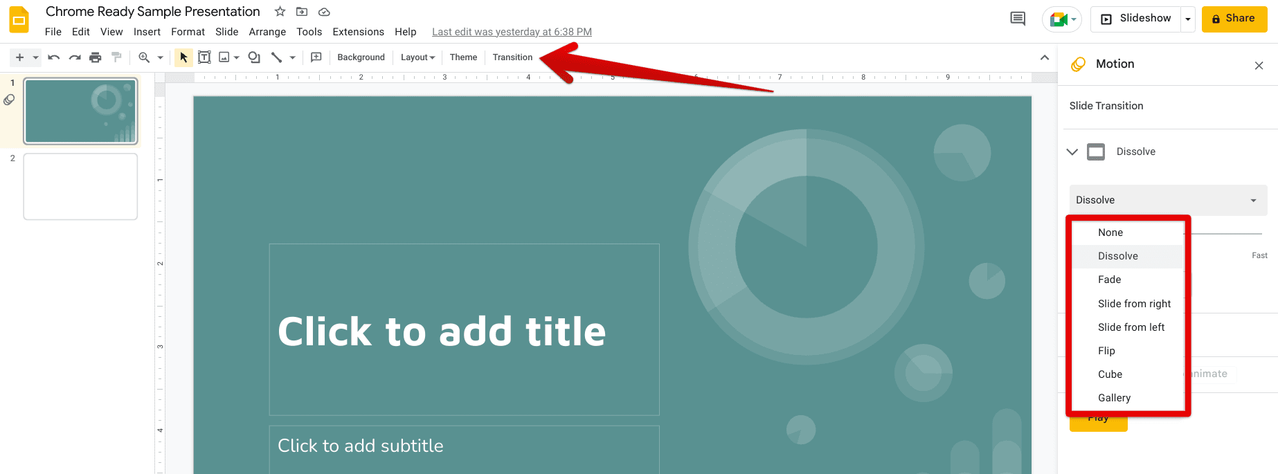
Choosing the transition type in Slides
Download the presentation
To download and store your Slides file locally, click the “File” button and select “Download.” As you do that, a swath of more options will appear in front of you, making it possible to choose the format you want the presentation to be downloaded. A popular format for saving presentations is Microsoft PowerPoint (PPTX), but you can select the file format per your requirement.
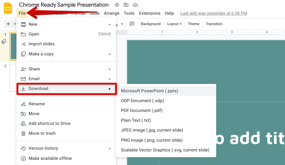
Downloading the Slides file
Sharing the presentation
Last but not least, after you’re done with your presentation, you can share it with others to get a second opinion quickly. Easy shareability is part of Google Workspace’s set of features, and we can observe it in Google Slides. Click on “Share” in the top-right corner of the screen and get ready to tweak the privacy controls of the presentation file.
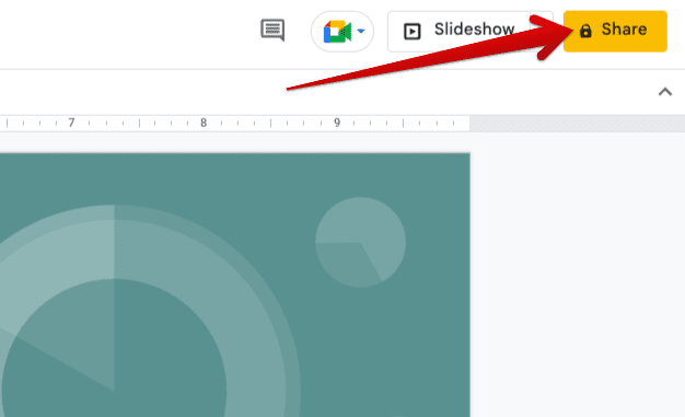
Sharing the Slides file
You can change the “General access” of the file by either allowing anyone to enter the presentation document with the link or only via an email invitation. If you change the setting to “Anyone with the link,” it becomes possible to set the role of your audience as well. You may choose from “Viewer,” “Commentator,” and “Editor.”
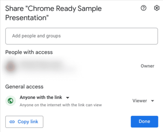
Sharing the presentation
Google Slides vs. Microsoft PowerPoint
Now that we’ve gone over Google Slides in detail, it’s essential to gauge how this platform compares with its competition, which is the ever-capable Microsoft PowerPoint. After all, PowerPoint has been around a lot longer than Google Slides since it was initially released in 1987. Slides, on the other hand, was released nearly two decades later, in 2006.
Currently, both apps are readily picked up by consumers worldwide, but there are considerable differences between them. For starters, Google Slides is cloud-first and boasts robust collaboration tools and features, so others can quickly hop onto your presentations without taking any extra steps. In addition, you will find Slides much more proactive in this regard, making it easy for people to work together and collaborate on big projects.
Microsoft PowerPoint can boast no such functionality. It lets you collaborate with others, but the process for making that come to fruition is nowhere as easy as what Google Slides offers users. To make a presentation shareable with others with editorial access, the document has to be uploaded to OneDrive first, followed by adding people to the presentation via email.
As you can comprehend, there are multiple steps on PowerPoint’s side of things, which isn’t the case with Google Slides. The latter features a one-click approach to sharing your file with others, including customizing the extent to which others will be able to interact with your document.
With that said, PowerPoint, being a veteran platform at this point, features robust template options where it seemingly has thousands of visual options to choose from. Google Slides is pretty limited in that regard. In addition, PowerPoint features a specific feature called “Designer,” and Slides has no equal. Designer lets you automate the theme of your slideshow according to its content.
Therefore, we can safely conclude that both options have pros and cons, so it all boils down to your preferences. Slides is quicker to manage and use while PowerPoint is relatively slower, but the latter features a vast array of templates and additional features to work with.
Additional Google Slides features
Although we’ve already covered most of the fundamentals associated with using Google Slides, it’s undoubtedly worth referring you to some of its advanced tips and tricks so that you can become a power user soon enough. Since the expert-level features comprise their in-depth understanding, we have created separate articles for them, so readers like you can painlessly comprehend those extra functionalities. The following articles will take it from here.
- How to add audio to your Google Slides.
- How to automatically convert your PDFs, Docs, and Slides to Google Forms.
- How to make organizational charts using Google Slides.
- Google Meet lets you join calls from Google Docs, Sheets, and Slides.
- How to make a slideshow on Google Photos.
Conclusion
Google’s extensive suite of desktop productivity applications falls under the domain of Google Workspace, which was once called G Suite until the re-branding occurred in 2020. The handful of apps comprised by this program all contribute heavily to the various business spaces prevalent across the world. To talk about Google Slides, the popular slideshow creator, is celebrated worldwide for its collaborative features and easy-to-use graphical interface.
In this guide, we’ve jotted down some of the most prominent highlights of Google Slides, including an in-depth explanation of its working interface. At the end of the article, we’ve briefly compared the application with Microsoft PowerPoint, which is yet another highly established slideshow maker offered by Microsoft. Please let us know if the write-up got you started with Slides just right. We would love to read your feedback!
- Read more: How to show Outlook Calendar in Google Calendar.
